Strategic Canvas
See your entire portfolio at a glance. Live project health, smart dependency mapping, and AI-powered strategic recommendations — all on one visual board.
Why It Matters
Managing multiple projects means juggling fragmented views across GitHub, Jira, and spreadsheets. The Strategic Canvas gives you something you've never had before: a single visual board where every project shows real-time health and you can map relationships between them.
The Value
- Cut status meeting prep from 30 minutes to 30 seconds
- Spot cross-project risks that are invisible in individual dashboards
- Get AI recommendations based on the full portfolio picture
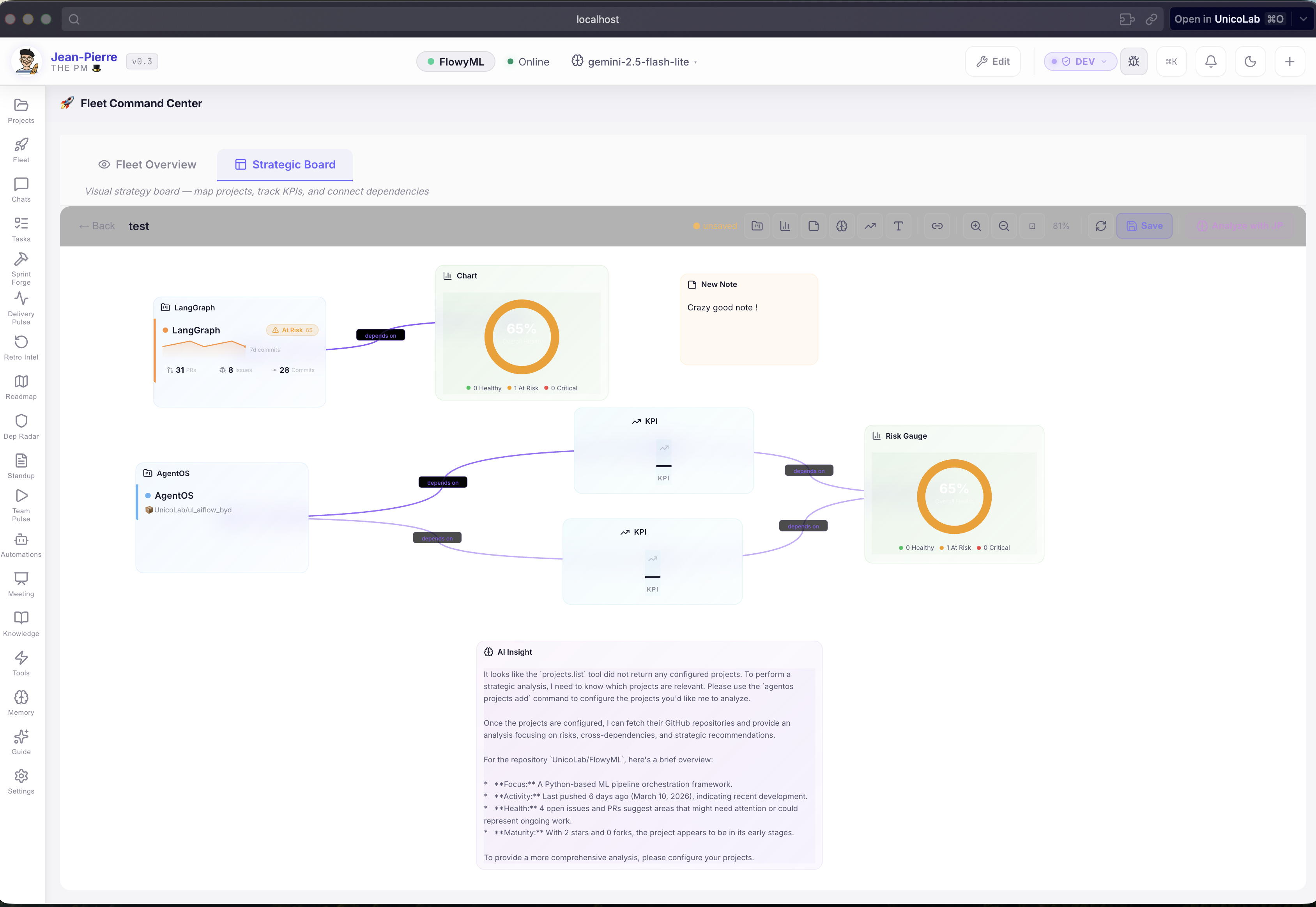
What You See
Live Project Cards
Drop any project onto the canvas — it instantly shows live data:
- Health Badge — Healthy, At Risk, or Critical — auto-scored from your live PR, issue, and sprint data
- Commit Sparkline — 7-day activity trend at a glance
- Key Metrics — Open PRs · Issues · Sprint Progress · Commit Count
No manual data entry. No stale screenshots. Always live.
Smart Connections
Map how your projects relate to each other:
| Relationship | What It Reveals |
|---|---|
| depends on | Hidden dependency chains that create risk |
| blocks | Active blockers across project boundaries |
| shares team | Resource conflicts and capacity risks |
| data flow | Integration points that need attention |
Risk Discovery
When you connect two at-risk projects as "depends on", JP immediately highlights the cascading risk — something you'd never see in separate Jira boards.
AI-Powered Strategic Insight
Click 🧠 Analyze with JP and Jean-Pierre sees the full picture: every project, its health, every connection. He delivers:
- Cross-project risk assessment — risks that only exist when you zoom out
- Dependency analysis — is a critical project depending on one that's already at risk?
- Resource insights — team conflicts between connected projects
- Action items — concrete next steps, not vague advice
Portfolio Health At a Glance
The portfolio health donut shows the distribution of healthy, at-risk, and critical projects. KPI cards auto-populate with aggregated metrics across your entire portfolio.
See immediately: "3 projects healthy, 1 at risk, 1 critical. Overall health: 72%."
Templates — Start in Seconds
| Template | Best For |
|---|---|
| Portfolio Overview | Weekly leadership check-in — all projects + KPIs + AI summary |
| Risk Matrix | Steering committee — projects grouped by risk level |
| Sprint Dashboard | Sprint planning — velocity and sprint health across teams |
The Bottom Line
| Without Canvas | With Canvas |
|---|---|
| Separate dashboards per project | One visual board, all projects |
| Dependencies tracked in spreadsheets | Visual dependency map with typed relationships |
| Risks discovered in meetings (too late) | AI-detected cross-project risks in real-time |
| Manual status aggregation | Auto-populated live metrics |
| Strategic analysis takes hours | One-click AI analysis of entire portfolio |